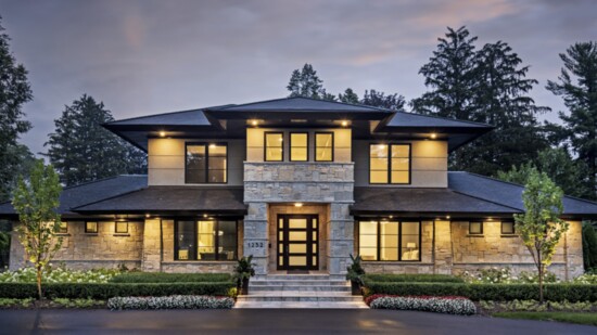
Todd Emerson has a type.
“I like symmetry,” says the founder of Sterling Custom Homes & Renovations in Bloomfield Hills. So when the builder and architectural engineer designed this new Birmingham home, modernized with long soffit overhangs and maintenance-free stone and stucco trimmed with sleek steel, his first focus was curb appeal.
He then brought the symmetry inside with a well-designed, functional and organic open layout. The combination of the beauty of the exterior and the easy layout was what really called out to the homeowners. “They told me there wasn’t a single thing they would do differently,” Emerson says. “There’s nothing else feature-wise that anyone could want in the house. It just layed out so well.”
Emerson and his team designed the home to the point of drywall, letting the homeowners choose all their interior finishes, “the jewelry of the house,” he says. The couple tapped Lucy Earl, designer and owner of Jones-Keena & Co. in Birmingham.
“The homeowners wanted a very clean, cool, modern aesthetic,” Earl says. “It’s very elegant and understated with small elements of drama. The wife is a very chic, beautiful and glamorous young woman, so everything has a bit of glamour to it.”
The main level bar is in the foyer, leading to the kitchen. “When I entertain, the first thing I do is offer guests a drink,” Emerson says. Backlit stone highlights a painting of supermodel Linda Evangelista, which Earl picked up at Robert Kidd Gallery.
The home is in Emerson’s own neighborhood, and sometimes he drives by at night. “It’s just so pretty,” he says. “The exterior came out better than I could ever imagine. And the interior is a true tribute to Lucy’s energy and taste.
“I’ve built and renovated hundreds of homes,” Emerson says. “But aesthetically and layout-wise, it’s my favorite house I’ve ever done.”
01// The kitchen, perfectly symmetrical, has a backsplash of underlit onyx flanked by a steel dish pantry by Gallery Steel on the right and a door leading to the mudroom on the left.
02// Earl custom-crafted a wall-to-wall headboard in a Mondrian-style colorblock pattern. A combination of linen velvet and pearlize-finished faux leather shimmers with subtle texture. The custom tete-a-tete chaise is finished in velvet. “This home is a lot about subtle textures and shifts in texture, from smooth to rough,” Earl says. “The chopped stone, the backsplash in the kitchen, the wallcoverings — and then enhanced with beautiful, subtle lighting to make all these textures pop.”
03// From the entrance hall, the open plan divided by a two-sided fireplace allows a view of everything all at once — a cozy living area with pops of yellow, an intimate seating space on the other side of the fireplace that leads to the kitchen, and the sunroom in the distance. Flecks of charcoal gray quartz sparkle from the chopped black rustic stone fireplace.
04// In the sunroom, retractable windows by Sunspace are made of glazed vinyl, but are clear like glass, letting the breeze in and the bugs out. Orange pillows add pop to the gray and black theme throughout the house.
05// Blue-black striated wallcoverings and window treatments, suspended from a tiny thin rod, cloak the dining room with understated, modern elegance. Performance velvet covers the dining chairs and the lustrous rug is wool and silk.
