The question I am asked more than any other is, "What's going on in the markets or economy?" So, occasionally, I like to share some charts/graphics, along with some brief commentary, to help answer this question.
This week, I have a few great charts to share on a wide range of topics, including the general financial health of consumers, the economy, inflation, and the markets.
I hope you find these notes offer valuable perspective as we work together toward your financial goals.
**********
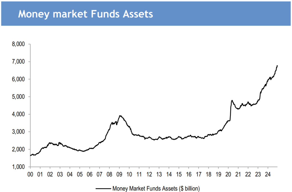
MONEY MARKET FUNDS ECLIPSE $7 TRILLION FOR THE FIRST TIME: It was just over a year ago that money-market funds passed the $6 trillion mark for the first time, and now they’ve passed $7 trillion. Remarkably, as you can see in the chart below, money market assets have nearly doubled since the start of 2020. Not bad for a time in which so many people have complained about how terrible everything has been. (Source: Sandbox Daily)
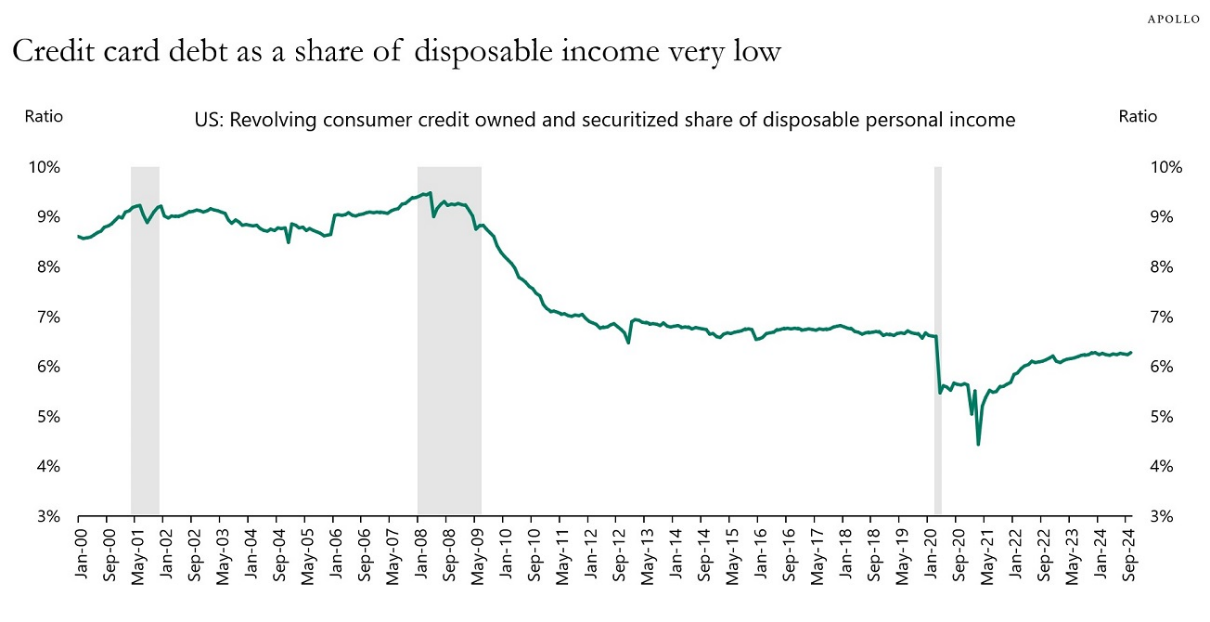
CONSUMER DEBT IS GROWING, BUT THAT’S ONLY HALF THE STORY, 1 OF 2: Not too long ago, consumer credit card debt topped $1 trillion for the first time and has since eclipsed $1.1 trillion. So, we already know that the media will sound the gong of worry for every $100 billion that is added (they love round numbers), but, of course, this tells only half the story. As we look at total household debt when compared to total assets, U.S. consumers are in a better position today than at any point over the last 50 years! As incredible as this is, I have yet to hear the media mention this fact. (Sources: Chart: Apollo; Credit Card Debt: CNBC)

CONSUMER DEBT IS GROWING, BUT THAT’S ONLY HALF THE STORY, 2 OF 2: While asset growth has outpaced debt growth by a considerable amount since the Great Financial Crisis, (as shown above), we’ve also seen credit card debt decline as a share of disposable income. With higher asset prices, increased cash holdings, and higher levels of disposable income, it seems that consumers are in great shape to weather most economic storms that might be on the horizon. (Source: Apollo)
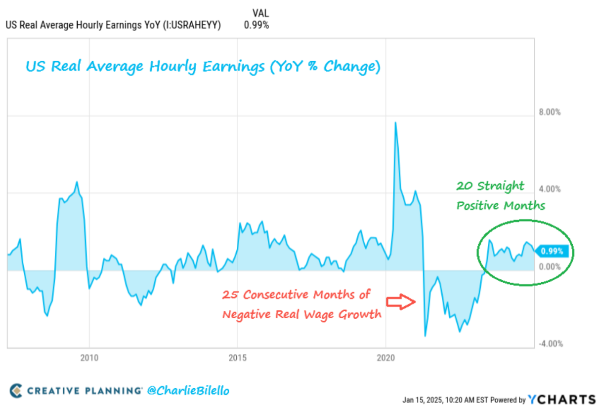
WAGES CONTINUE TO OUTPACE INFLATION: Despite inflation ticking up again (we’ll get to that in a moment), wages continue to rise faster than inflation and have done so every month for the last 20 months. Certainly, these rising wages are helping to fuel additional disposable income and keeping debt payments in check, as previously noted. We can only hope that this trend continues throughout 2025. (Source: Charlie Bilello)
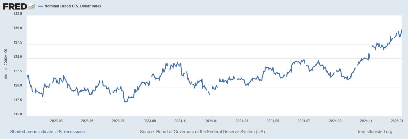
THE DEATH OF THE DOLLAR HAS BEEN TEMPORARILY POSTPONED (AGAIN): You may recall that in the middle of 2023 (which feels like a decade ago), there was a broadening concern about de-dollarization and the general decline of the dollar. Based on the media’s sentiment at that time, it felt like the dollar was surely doomed. Well, over the last few months, the dollar has been on a tear (when compared to a basket of six other world currencies), routinely making new highs. While nobody can definitively say why this is the case, we can likely tie the dollar’s performance to our comparatively strong economic and productivity growth, equity performance, and higher yields. Perhaps not surprisingly, the conversation is now shifting to whether the dollar is currently overvalued and destined for a collapse. It’s as they say, the more things change, the more they stay the same. (Sources: Chart & Recent Performance: St. Louis Fed; 2023 Concerns: Schwab)
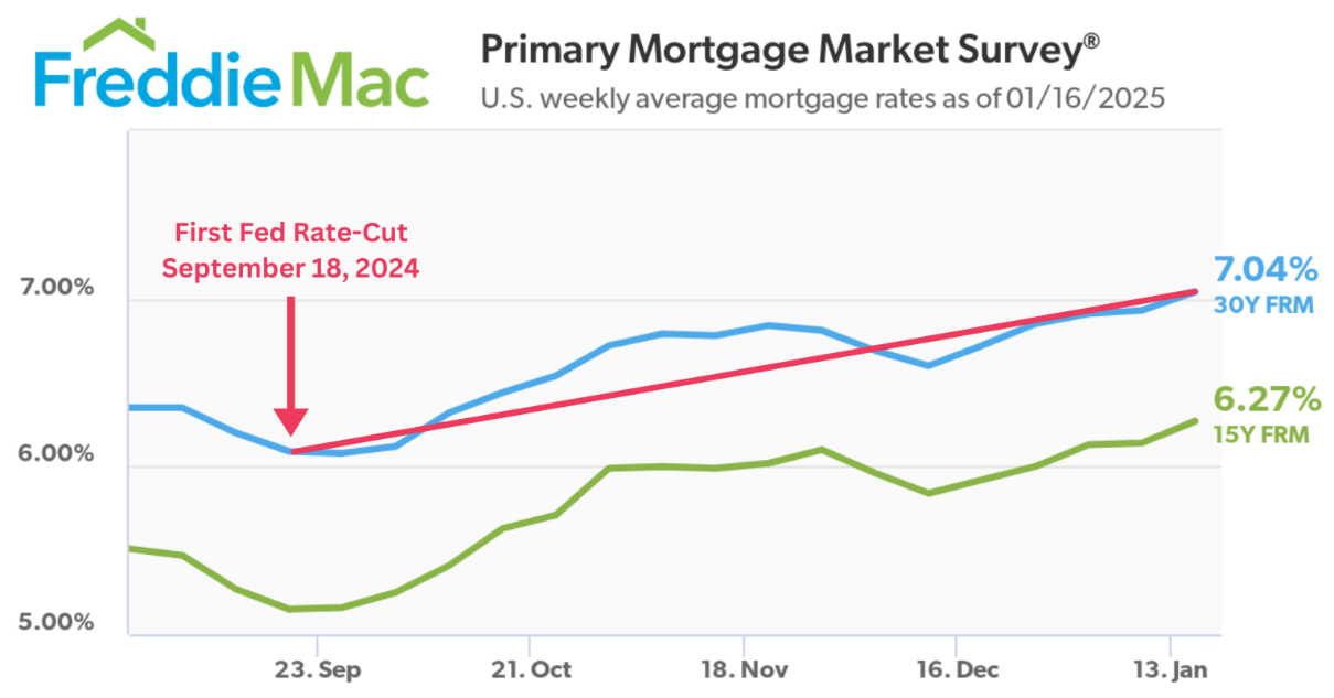
IT’S NOT ALL ROSES…MORTGAGE RATES ARE (ODDLY) RISING: Perhaps the most perplexing recent phenomenon has been that the average 30-year mortgage rate has increased by a full percentage point even as the Fed has cut rates by that same amount. There are a lot of factors that go into mortgage rates, but this one has many people scratching their heads. What appears to be happening is that our robust economy is increasing the fear that inflation may spike again, which has caused the Fed to alter its future rate outlook. This change in outlook seems to have caused a jump in 10-year Treasury yields, which influences mortgage rates. I guess you could say, “It’s complicated.” One thing we know for sure is that the housing market could use a reprieve. (Sources: Rates & Chart: Freddie Mac; Fed Outlook: Federal Reserve; 10-Year Treasury Yield: St. Louis Fed)
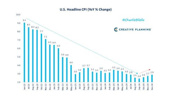
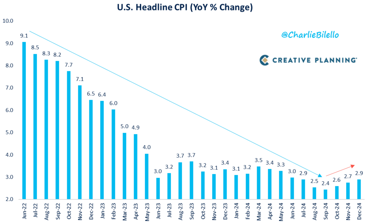
IS INFLATION STILL A PROBLEM?: Part of the reason for the Fed’s cautious approach to rate cuts is the apparent stickiness of inflation. As you can see in the chart below, inflation has started to creep up a bit. Though, we should note that this would be the third time inflation has done exactly that since it peaked almost three years ago, with the first two instances not amounting to much. So, I guess the answer to our question above is maybe, but maybe not. We can’t say for sure because inflation is a moving target, which is why Fed leaders have been nimble in their approach. While the ripple effects of fighting inflation are not fun (what’s happening with mortgage rates is one example), it would serve us well to remember that these effects are all preferred to rapidly increasing prices. (Source: Charlie Bilello)
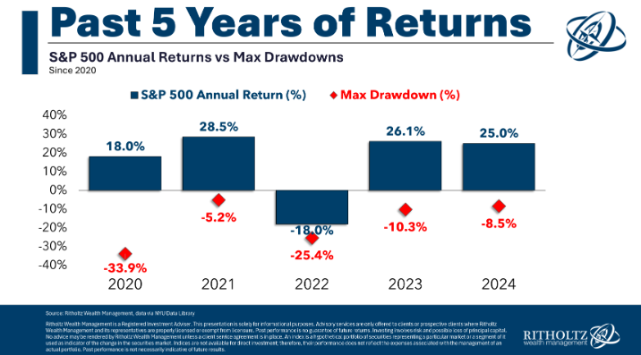
VOLATILITY DOESN’T (NECESSARILY) MEAN POOR RETURNS: Imagine a five-year period where we experienced successive market drawdowns in the following amounts: -34%, -5%, -25%, -10%, and -9%. In this hypothetical five-year period, would you guess that the market had a positive or negative return? As I am sure you’ve figured out, this example represents the last five years in the market. And as I’m sure you know, not only were returns not negative, but they averaged an incredible +14% per year, with dividends reinvested. That means that, despite all that negative volatility, $1 invested at the start of 2020 (ignoring costs and taxes) would be worth about $2 today. I hope you’ll keep this point in mind whenever volatility returns in the future. I suggest that it probably won’t be the end of the world next time either. (Sources: Chart: A Wealth of Common Sense; Average Annual Return: Political Calculations [2020.01-2024.12])
It’s indisputable that there are some concerns starting to brew, but let’s be honest: Isn’t there always something to worry about?!
Despite all the headwinds we’ve encountered so far this decade (and continue to experience), the market, the economy, and the American consumer have thrived to the surprise of nearly everyone—including the Fed, economists, doomsayers, and pundits alike.
To be clear, these last five years may tell us little about the future, but they have shown how incredibly resilient our markets and economy are, which is something we should all find encouraging as we look toward the future.
I hope you’ve found this note to be helpful in that effort. As always, please be encouraged to reply or call with any questions, and most importantly, stay the course!
*Diazo LLC is registered as an investment adviser and only conducts business in states where it is properly registered or is excluded from registration requirements. Information presented is for educational purposes only and should not be regarded as a complete analysis of any topics discussed or as personalized financial advice.