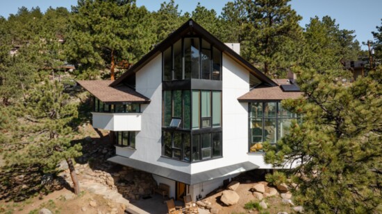
From the 1950s to the early 1980s, architect Charles Haertling designed some of Boulder’s most iconic residences in his inimitable style, blending geometric forms with those of the natural landscape that surrounds them (sometimes as wild as mushrooms or barnacles). One of his designs, a 2,418-square-foot home built in 1967, was recently transformed by Denver architecture firm Factor Design Build, who ushered it into modernity while carefully preserving its original architectural flair.
Nestled within the foothills near Sunshine Canyon, the distinctly angular home had been updated a few times over the years but still lacked a cohesive aesthetic and functional layout. A detached, Southwest-style accessory building constructed in the 1980s only added to the property’s disjointed vibe. The goal for both structures? “We wanted it to seem like we were never there,” says Dain Carlson, architect at Factor. “How they lived back then is so different from now, but that’s the fun part—trying to get older houses to work for today’s families without screwing up what they love about them.”
To modernize the home’s interior, the firm knocked down the wall separating the dining area and kitchen. A sliding glass bifold door was then installed to improve the connection between that expanded space and a cozy outdoor patio that rests at the bottom of a rocky hillside. Materials like flat panel cabinetry painted with a creamy white hue echo what might have been used in the 60s, while complementary wooden accents, like the custom walnut island with a stone countertop and waterfall edge, add contemporary character. Factor also refreshed the primary bedroom, three guest bedrooms and three bathrooms with new paint, lighting, hardware, spacious trough sinks and sleek accessories such as walnut floating shelves and towel hooks.
Before it was updated, the adjacent 984-square-foot adobe structure “felt really dark, with rustic wood beams, a wood ceiling and wood and tile floors,” Dain says. “It was like a cave. The main house is above the ground with huge windows that let in tons of daylight, but this building was subterranean. It sank into the earth and had hardly any windows. Totally the opposite.” To match the lightness of the primary residence, Factor painted the taupe exterior white, replaced flooring with polished concrete and added steel beams to the ceiling. They kept the rounded Kiva fireplace (“It’s such a cool feature,” Dain adds) and reupholstered a built-in bench in a textured gray fabric. Zoning laws prevent a full kitchen, so the architectural team added a clean, modern bar sans cooking appliances. At completion, the once gloomy interior metamorphosized into a bright and airy sanctuary that serves as a versatile flex space.
Funnily, the owners of this Haertling home tried to purchase it a couple of times before succeeding when it hit the market a few years ago. They discovered the home’s original sketches from the 60s, using them as inspiration for the renovation accomplished by Factor, whose portfolio features homes dating back to the 1800s. “They wanted the finishes to be minimalist and modern with a neutral color palette, and for the existing design to be the focus—not what we did to it,” Dain shares. “They’re excited to have this historic piece of architecture.”
To learn more, visit factordesignbuild.com
