Every meal holds quiet magic. Nourishment that feeds body and soul. Especially when art shapes each step.
From painted recipes to illustrated ingredients, hand-thrown vessels to thoughtfully plated dishes, four Maine artists infuse creativity into every course, reminding us that artistry lives not just around the table, but within it.
Brenda Erickson Paints the First Course: A Watercolored Recipe
Before the food is plated or the table is set, Brenda Erickson begins with something quieter—something sacred. She paints the recipe.
In delicate brushstrokes and handwritten script, Brenda captures not just ingredients, but memory. A grandmother’s octagonal dish. A worn wooden spoon, angled just so. A red velvet cake served with a three-pronged fork. “Every recipe has a story,” she told me. “I paint memories for people.”
Brenda started painting recipes in 2003, quietly and without fanfare. “I didn’t tell anyone at first,” she said, laughing. “It felt a little farfetched.” But when she began sharing her work, including for the Maine Lobster Bake, friends quickly fell in love. Over the past two decades, she’s painted nearly 400 recipes, most of them commissioned by families hoping to preserve something more than a meal.
Her process is intimate and meticulous. She makes every recipe herself to understand its color, texture, and shape—the holes of a cake and how the crust cracks just so. Then she sketches, asks questions, and revises. Customers are very particular, telling her what matters most. The exact electric mixer. The right plate. The number of oatmeal cookies. She listens carefully, and she gets it right.
The result? Art that brings personal history to life. A dish passed down for generations. A meal grandma made just right. A recipe that stirs laughter, stories, and sometimes tears.
When Brenda paints a recipe, she’s not just starting a meal—she’s setting a tone. Honoring the artistry that comes before the cooking even begins.
The recipe is where the story starts. And in Brenda’s hands, that story becomes art.
With playful illustrations, Jillian Brazel elevates the beauty of everyday ingredients
A meal is nothing without its ingredients. They are the overlooked essentials that make everything else possible. Before a recipe takes shape, before a dish is plated, there’s the humble tomato, the bunch of carrots, the sprig of thyme. Jillian Brazel notices them. She sees them. And through her illustrations, she asks others to see them, too.
Jillian came to art in 2017, mostly self-taught, always drawn to color, texture, and pattern. It was a natural match for someone whose life was already steeped in food. She trained in culinary school, worked in restaurants and bakeries, even managed a produce department. Food, she says, has been woven through her life so when she began making art, it naturally became her subject—ingredients playing a lead role.
She delights in their seasonality, in the way a beet and carrot show off their color and fun greens. She finds beauty in the details often ignored—the gooey seeds inside a tomato, reimagined as delicate line work, bright and full of movement. “The humble tomato,” she says, “is actually a really amazing thing. And, look how cute it is.”
Her work is playful and whimsical, yes, but it is also reverent. By elevating an ingredient on paper, Jillian gives it weight and wonder. She traces it back to the field, the hands that picked it, the table where it will be shared.
Like a meal, her process has its messy stages, but she keeps going. “A big part of creating artwork for me has been learning to not stop at that moment and to keep going and playing and experimenting.” Whether sparked by the memory of summer produce in midwinter or fresh finds at the farmers market, Jillian’s illustrations invite people to see ingredients differently and to digest just a little extra joy.
Ayumi Horie crafts everyday vessels that turn eating into art.
Ayumi Horie believes the simplest things can hold the most meaning. Pots and food, both so ingrained in daily life that we often overlook them, become essential once we pause to consider their role. “People take pots for granted,” she says, knowing her vessels impact people’s lives in a much quieter fashion.
For Ayumi, a vessel is never just a backdrop. With the rise of celebrity chefs and attention on plating, she insists her pottery should be an equal partner in dialogue with the food. “The object is as critical to the experience of eating as the food is.” A ramen bowl, for example, is designed with care for every detail: the slope of the wall for chopsticks, the horizon line of broth where imagery comes into view, the height of the foot so a hand does not burn while holding it.
She sees pots not only as functional but also as deeply sensory. “You have all the visual elements of a ceramic object. But when you start adding in the way it feels in your hand, the sound of a stack of plates, the smell of the food — it becomes a holistic experience.” In this way, vessels carry both memory and novelty. “I think pots can be as nostalgic as food can be, and I think similarly, it can evoke a new experience.”
What she hopes most is simple: that her pots help people feel grounded. “I want them to feel solid and steady, like an old friend,” she says. “We spend nearly a third of our day thinking about food, cooking it, and eating it,” and her vessels are there alongside us, faithful companions preparing us for “a small act of bravery that may be needed that day.”
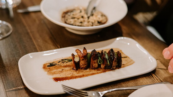
Chef Hannah Ryder turns plating into art as the final step of the meal.
At Twelve, plating is the last chapter in the story of a meal. Hannah Ryder gets to write it.
When a dish arrives tableside, it rarely looks like what people expected. That’s by design. For Hannah, the magic of the meal begins before the first bite. “I love when someone has an idea in their head of what something will look like,” she says, “and then it’s completely different. That surprise is part of the experience.”
Hannah plates with a sense of movement. She doesn’t want anything to look too perfect. Sometimes she’ll tell her cooks to close their eyes as they plate something. Let it fall where it falls. “If it’s randomized, it’s more fun,” she says.” The goal isn’t perfection. It’s presence.
Her style draws from Nordic influence. It’s minimal, thoughtful, cohesive. Color and shape mirror the season. A summer dish might lean bright and bold. Winter, more muted and earthy. She often plays within a single palette. “If it’s a tomato dish,” she says, “the whole thing might be different shades of red.” A single flower, placed just so, can carry the whole thing home.
Instead of highlighting technique, Hannah is more focused on the thing itself. Guests might see a wavy blanket of crisp onions dotted with tiny purple flowers. A soft arc of beef tartare with just enough movement to draw attention.
One dessert where visual presentation rivals taste is a floating island. What begins as a still image becomes something else entirely when a bright rhubarb crème anglaise is poured tableside. That transformation becomes part of the memory.
The meal ends, but the moment stays. Guests often take out their phones, wanting to remember what they saw. Hannah watches from the chef’s counter, never taking their experience for granted.