The team at Yarmouth-based Centerline Design and Build understands that homes these days must evolve with the people that inhabit them—just because a room worked well a decade ago doesn’t mean it still fits a family’s needs. When the owners of a 1950s Colonial home in Portland called the firm to remodel their kitchen and two bathrooms, it quickly became clear that principal designer Jeanne Rapone and senior designer Kelly McNulty could do even more to make the home a perfect fit. “Though it’s on a smaller scale than today’s newer Colonials, the home’s square footage was adequate for the family’s needs,” the designers said. “We loved its cozy charm, but it had an awkward layout. As we spoke about ways to improve the kitchen, the entire first floor became our new scope of work.”
To improve the flow of the home, Rapone and McNulty planned a mudroom with a built-in bench and space for coats and boots, along with a renovated powder room. “In order to widen the mudroom to allow for these built-ins, we opened up the wall between the kitchen and dining room. The dining room was as big—if not bigger—than the kitchen, so we borrowed some space that allowed us to expand the kitchen’s footprint.” New cabinetry and a countertop in the dining area gives the clients buffet and bar storage meant to feel more like a built-in and less like kitchen cabinetry.
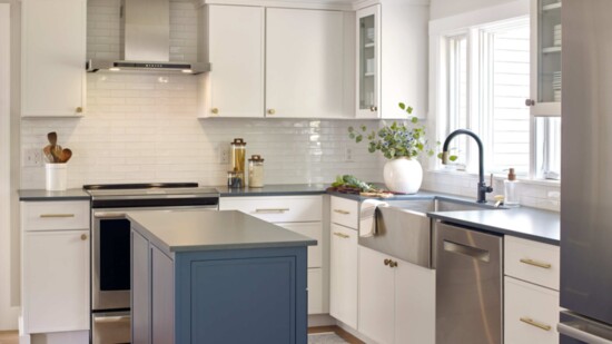
“In the kitchen, we gave the family a prep island, a wall for tall cabinets that store food and small appliances, and a cabinet for the speed oven. By rearranging the room’s original layout, we moved the refrigerator closer to the eating area and removed any cabinetry that descended to the countertop—they have much more counter space now than they did before,” the designers said.
“All living spaces should be accessible to one another,” Rapone and McNulty note, adding that accessibility improves the traffic flow and overall energy of a home. For that reason, the duo created openings on either side of the living room for quick access to both the kitchen and the family room. Creating these openings added symmetry around the family room’s fireplace and gave the entire first floor better circulation from the foyer. Rapone and McNulty enhanced the family room’s entry by replacing its narrow double louver doors with glass pocket doors, nearly tripling the size of the opening. With a fresh coat of paint and a centered fireplace, the family room became a sought-after feature of the home instead of a closed off, uninviting room.
Upstairs, both the hallway bath and primary bath were redesigned to give the home an updated feel. In the hallway bath, which originally housed a phone booth-style shower and a large, separate tub, Rapone and McNulty added a combined tub and shower area that left them with space to build a large linen closet and expand the vanity area. As for the primary bath, “It’s the smallest we’ve ever designed, but it was tons of fun,” they said. “We borrowed space from a built-in bookcase in the primary bedroom and used it to expand the shower and improve the sink and mirror area. There were lots of restrictions with this space, but in the end, we were able to beautifully transform it without major renovation.”
