Like varied musical instruments in an orchestra a design palette must be replete with high notes, deep sounds, and rhythms. Musical scales make reference to volume in much the same way that we physically define spatial parameters; Like architecture, music is spatial in how it affects the listener’s senses, creates ambiance, and makes textural definition through rhythms. Comparatively, all design and decorative styles affect the emotions and comfort levels through spatial proportions, volume, and color. The correlations are endless and sometimes obvious, so how is this a useful tool in creating design plans that truly sing in harmony?
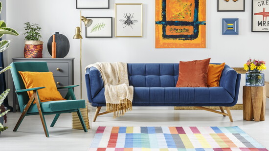
The first step is color. Color is the glue of the symphonic collage. Even neutral palettes require color theory. As in music, there are scales - color scales are value and hue; value is the scale from light to dark and hue from bright to dull. Because color is spatial it will change the feel of a plan according to the intensity or its placement in a space. What that means is the same room or exterior of a house will look totally different depending on color choices that rely on the ratio of value to hue and the position where the color is applied. Even disparate styles of furniture or decorative detailing can be brought into harmony with a coordinated palette, which is why color is the glue.
When choosing color start with three mid-range tones that work well together and that respect the volume of the intended space. The brighter (louder) or darker (deeper) the color the more room it will need to not overwhelm the space. Then find the darkest and the lightest version of those colors and the brightest and most dull version of the same. Accent areas, like one wall or an alcove, can be the brightest or darkest versions of a general wall color and will flow naturally into harmony. Spatially, similar values or hues will flatten out a space that has too many angles and conversely mixing up values and hues will create depth and visual dimension.
The next consideration is scale and spatial lay-outs. This ratio is probably the most difficult to reconcile. The key note here is to start with the largest feature in the space and work down to the smallest. Furniture or architectural features such as windows and doors must fit the volume in complexity of detail as well as actual size. Each element adds volume, which is good when needed and not so good when it creates crowding. It also depends on the style and the feel that you are after; an economy of notes works for Bartok, but Mozart would not be Mozart with fewer flourishes. Decide on how you want the plan to feel: open and airy, formal, modern or traditional and keep that theme running through all of your choices. Like a musical motif, the concept should remain characteristic of the composition. Too many variations on this over-arching theme will create discord. Space your space accordingly; layouts depend on how you want to use the space and what is realistic. Color is a great way to enlarge or decrease the feel of a space and so are patterns and textures.
Music is a doorway to the emotions and symphonic compositions are the mansions of that trade. Even that which appears simple in a design context requires the concise and skillful orchestration of complex realities - especially those intended, in their final form, to produce effect on the space and its inhabitants. If you enjoy orchestral music, you will surely see the similarities between the two art forms and apply them generously. Gorgeous design begins with a vision and a plan the color of the music is up to you!