My obsession with color started young. Mama kept an array of art supplies around to keep her four children entertained. Play-Doh, watercolors, crayons, Cray-Pas, construction paper, felt, embroidery thread, scissors, and paint brushes were always at hand.
By the time I was five, I could explain the ROYGBIV acronym to my friends with the precision of a chemist, doling out crayons from the treasured box of 64 I had organized by hue. I had the names memorized likely before I could read them: Magenta! Cornflower, Maize, Red Orange! Raw Sienna, Sea Green, Periwinkle! Silver and Gold!
I would create my own color wheels, tracing plates to make the circles, blending the watercolors well beyond the primary and secondary colors to achieve the perfect midnight-purple, the just-right turquoise, the most acid of yellow-greens.
In high school, it was acrylics and gouaches, and then, as a young adult, I discovered Feng Shui, which drove home the meanings of colors and their powerful impact.
It is no surprise that color affects us. Most people would easily describe red as “hot” and blue as “calm” or “peaceful.” Yellow is usually “cheerful.” And so on.
A kindergartener could tell you this.
But let’s take it further...
Could you sleep well in an all-red bedroom?
Would you wear black and orange outside of Halloween?
There is a reason we wear white as brides and dark colors for funerals.
Color tells a story. It communicates. It’s a literal frequency, by golly.
It tells us to stop when driving. Red is the first color the eye sees, so red for stop signs and stop lights is an intentional—and wise—choice. And in this Bama fan’s opinion, red gives us the advantage there, too!
It tells us if we are in a serious meeting...
...or at a baby shower.
As a Feng Shui consultant, interior designer, and filmmaker, all this color knowledge has obviously come in handy.
When I start a new film project, I get out my color cards (not paint chips!) and choose a palette that conveys the feeling I want. It’s not necessarily a literal palette, but a “mood,” a loose way to begin. When I show it to other crew members, it’s instant information.
Same with an interior design client. I spread out the colors on a large table, advising them not to think about their home—that I just want to get to know them better. What are their favorites?
Some colors light us up. Others repel us.
And the message is clear: we are here to play!
After all, a room is simply a world of its own made up of color, shape, and texture. It’s how you put these elements together that gives function, flow, and form, a.k.a. design.
My love and deep study of color is why I was a little put off by Pantone’s 2026 Color of the Year.
White.
Yeah, yeah, they fluffed it by calling it “Cloud Dancer,” but it’s white...with the faintest hint of gray.
Snooze!
Please understand I am not against using white in decor or fashion! It's great for so many things. It's just not the right color for 2026. In backlash, many folks in the visual fields went online and chose a new Color of the Year. So I did too.
Here was my Instagram caption for my choice, which accompanied an image of Lady Liberty:
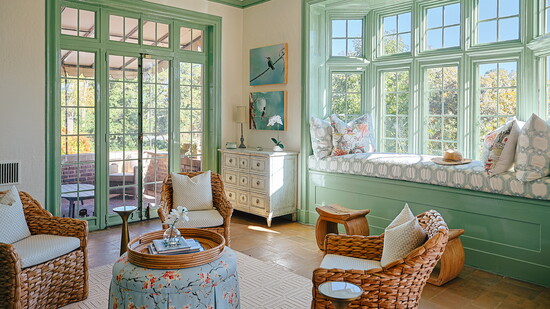
Patina Green is my pick for the “Better” Color of the Year for 2026.
The last slide on the reel reveals my muse, a special lady who carries light and knowledge, broken shackles at her feet, representing freedom for all.
The more I got acquainted with Patina Green, I realized how far a cry it was from #clouddancer #white.
It’s earthy, gritty, textured.
It’s alchemy, a literal chemical reaction.
It’s about the perfection of imperfection.
It shows age—gracefully, beautifully, surprisingly.
It unveils the mysterious unfolding passage of precious time.
It’s a return to nature—a gift from the elements.
It reminds us that a bit of wear and tear and texture offer character and truth.
Not everything has to be shiny and new. We don’t have to buy what they’re selling.
Patina Green can’t be put in a box or numbered, and it certainly can’t be manufactured.
So take your pick out of the array of blue-greens, my dears.
In 2026, slow down and appreciate Patina Green. Take yourself on a scavenger hunt in search of it. It may appear at the bottom of an old wishing well or covering the water fountain at the forgotten corner park; it could show up as lichen tucked into a fat tree’s bark…or on the weathervane at your uncle’s barn.
Patina Green is an invitation to play and a reminder of nature’s mysteries. I hope you enjoy getting to know this color in new ways in 2026.