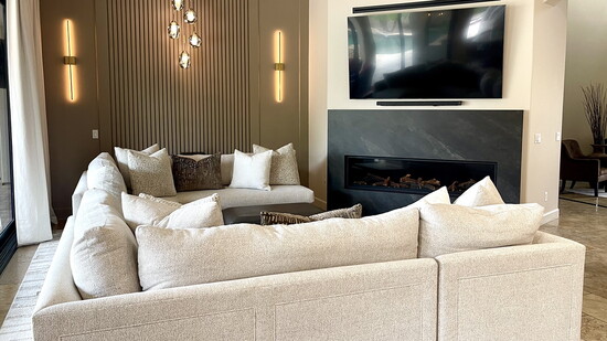
If you're looking for a change of scenery in your daily life, paint is one of the fastest, easiest, and most budget-friendly ways to transform your home. But with seemingly never-ending options ranging from traditional to trendy, selecting your colors can be overwhelming.
A good place to start is by choosing shades and color schemes that are new and stylish.
A warm, versatile palette is where preferences are shifting to, says Sue Adame, owner of Eagle Ridge Color Consulting, which provides in-home services for interior and exterior painting projects.
“More homeowners are keeping things light with off-white and colors that are very soft and neutral,” Adame says. “Everyone is looking for a little more peace in their life, and they’re looking for calm, neutral colors, but they still want color.”
A monochromatic, layered, textured look is the way to accomplish this. Start by selecting a color—such as an off-white or light tan—for the common area. Then, choose a tone or two deeper with beiges or latte- and mushroom-inspired hues in secondary spaces. To finish, add a rich brown or charcoal hue for a touch of elegance.
“Layering your colors in a shade or two off from each other creates depth,” Adame says.
Incorporating the “60-30-10 rule” is also helpful. The common color, such as a light natural tan or pale beige, comprises 60% of your home’s color that’s reflected on your walls and sofa, for example. The secondary color accounts for 30% of the palette and is used for focal walls and accent furniture.
The remaining 10% is where you can be expressive, using bolder colors on a kitchen island, range hood, or built-ins. In addition to neutrals, earthy greens, terracotta, and similar nature-inspired colors are also making a comeback. They are well suited for adding pops of color with accent pillows, rugs, and even an often-overlooked feature.
“The inside of your entry door is a great place where you can have some fun,” Adame says. “It’s only a quart of paint, and you see it everywhere you walk through the home. That brings a little bit of satisfaction, and you don’t feel the need to push that bold color on the wall.”
But the power of pigment goes beyond the brushstroke. It can transform amenities that the paint never touches.
“I’ve been able to save carpet, flooring, and furniture just by changing the perimeter with color,” Adame says. “Choosing the right paint color can save homeowners so much money and make them so happy.”
“Everyone is looking for a little more peace in their life, and they’re looking for calm, neutral colors, but they still want color.”—Sue Adame