Baylor Pillow, BEEP Design Co.
“Mixing patterns comes down to three things: color value, pattern scale and the mix of prints themselves. Billy Baldwin said you must think about how a room makes an item look, then how that item makes the room look—true for fabrics too.
In a favorite client's parlor, a huge floral takes geometric cut-velvet pillows with ease. On a midcentury sectional, though, another large floral wouldn't work—it'd feel like trying too hard. Create a composition: consider where your eye lands first, and what plays nicely with it. Colors should be roughly the same intensity, though a fun pop with the volume turned up keeps things feeling real, not overdecorated. Too perfect, and a room turns neurotic. As a rule, we want things to be cousins, not twins.”
Caroline Lovelace, Lovelace Studios
“Pattern doesn't have to mean bold or over the top. The lion medallion wallpaper is neutral, color wise, but has amazing pattern—it brings personality to a bathroom that would otherwise feel toned down. Same with the kitchen tile: it's not overly colorful, but if we'd only used white tiles in that pattern, it'd feel flat. Pattern plus repeat and color creates a true showstopper.
I'm a more-is-more girl when it comes to scale, leaning toward larger patterns, then peppering in smaller scale for balance. I don't have a formula; I just keep trying combinations until they feel right. I want people to make bold decisions—I've never had a client regret it.”
Tara Engelberg, Tara Felice Interiors
“For this powder room, I wanted to create a space that felt immersive, unexpected, and a little bit theatrical for a color loving client with big personality.
I loved the idea of taking a traditional floral and giving it a more modern attitude. Rather than pairing it with another bold print, I let the wallpaper be the star, bringing in contrast through the other elements. The antique-inspired gilt mirror introduces an ornate, sculptural quality against the busy floral, while the simple striped linen towels offer a quieter, graphic counterpoint. The lacquered vanity adds a crisp, contemporary edge, its reflective finish creating tension against the traditional chintz and gilt mirror.
I love this tension between traditional and modern—it gives the room a sense of timelessness, creating a layered aesthetic that endures beyond any single trend.”
Hathaway Holmes and GCD Interiors
"I always start with a 'star of the show.' For this project, that star was a bold animal print, and everything else grew from there. We pulled in textures that can hold their own—a nubby bouclé to soften the edges, buttery leather to ground it. Then patterns: a subtle stripe, a soft geometric, each chosen for how its scale plays against that original. I'm watching for the call-and-response—a matte finish quieting a high-shine silk, a rust tone from the print echoing in a wool throw across the room. Layer that against the architecture and how light moves through the space, and that's what sets the tone. This mood board was part formula, part feeling. That mix of structure and instinct is what makes a space feel truly their own."
Anna Lattimore, Anna Lattimore Interior Design
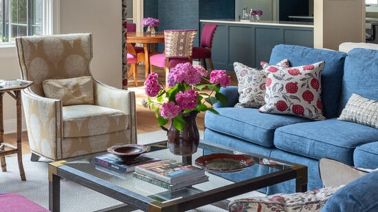
“We started with the pomegranate block print on the dining windows, then repeated it as pillows on the sectional to move the color and pattern around the space—that's what creates balance. The scale is bold enough to hold its own against the navy cabinetry, wood ceiling, and big windows, and that magenta just shimmers against the navy grasscloth walls, pulling your eye through the room.
Reigning in color while varying scale is really what makes patterns work together. There are 11-plus fabrics in this room, but it still feels calm and cozy. One tip: don't feel like you need to match colors exactly—use different shades within your palette to add depth. Once everything's installed, that variety is a good thing.”
Meg Johnson, Meg Johnson Design
“Every room begins with something that sparks joy for my client. Here, after pulling a few samples, she was instantly drawn to the willowy trees in the wallpaper, reminiscent of the live oaks that line her Mississippi Gulf Coast hometown. From that anchor, I layered in as much color and pattern as possible. The mix feels curated but playful: an abstract floral on the iron stools, animal print on her grandmother’s cane egg chair, a natural sisal rug, plus a vintage Suzani tapestry and watercolor shibori linen. Scale is key to blending—start with a large motif, then move from large to small—but texture is important. A floral and a stripe are always in the mix.”