Design trends often reflect more than what looks good in a room — they reflect how people want to feel in their spaces. One color rising to the surface does exactly that: Rebel Pink.
Bright, expressive, and unapologetically playful, Rebel Pink marks a clear shift away from the quiet neutrals and muted palettes that have dominated recent years. In their place, it invites optimism — a reminder that homes can hold creativity, emotion, and a little bit of fun.
According to IKEA, Rebel Pink is rooted in the idea of play — not just for children, but for everyone. The brand notes that play sparks happiness, evokes nostalgia, and encourages new ways of thinking. It’s a timely message as more homeowners rethink spaces that do double duty: rooms that support everyday routines while still reflecting personal style.
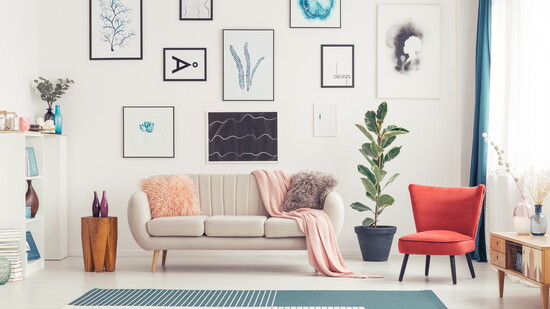
Unlike softer blush tones, Rebel Pink carries energy. It’s bold without being overwhelming, expressive without feeling childish. Used thoughtfully, it can warm a space, create a focal point, or bring personality to a room that’s starting to feel a little too predictable. The secret is grounding it with natural materials and calmer tones so the color feels elevated, not loud.
It’s also remarkably versatile. In small doses — a chair, a throw, artwork, a lamp, or a few well-placed accents — it adds lift and individuality. Go bigger with a feature wall, cabinetry, or statement textiles, and it becomes the moment that anchors the room. Rebel Pink also plays well with unexpected companions: warm whites, soft grays, camel leather, light oak, brushed brass, matte black hardware, and even deep greens for contrast.
If you’re curious but cautious, start with removable wallpaper, pillows, or artwork and see how it changes the mood of the space throughout the day. In brighter rooms, it reads airy and cheerful; at night, especially under warm lighting, it can feel cozy and sophisticated. Paired with layered textures — linen, boucle, rattan, or stone — the look stays inviting and lived-in.
In Temecula, where many homes balance warmth, openness, and everyday livability, Rebel Pink feels right at home. It shines in light-filled spaces and pairs naturally with wood tones, stone, and neutral backdrops common in local design.
Whether layered into a living area, tucked into a bedroom, or used to brighten a smaller space, Rebel Pink adds character without overpowering. It’s a reminder that thoughtful design doesn’t have to take itself too seriously — sometimes the best rooms are the ones that make you smile.
Rebel Pink offers an invitation: play a little, trust your instincts, and create a home that feels as joyful as it is intentional.
Rebel Pink was named a 2026 Color of the Year by IKEA, reflecting a broader shift toward playful, expressive design.